conventions and techniques
The Web has grown exponentially since its inception. Though it was initially seen as a space for researchers, hobbyists and fandoms to congregate and share their interests, today having a website is seen as a requirement for every brand and institution. Plenty of platforms exist for quickly carving out a brand's corner of the Internet, whether that's creating a social media account or using a website builder like Squarespace or Wix, but when a brand wants a unique and custom online presence they turn to web designers. Web designers approach HTML and CSS from the point of view of graphic design, concerned with traditional design concepts like typography, composition, color theory, etc.
However, the Web presents unique challenges that graphic designers never had to consider before, for example: how do you achieve a balanced composition when you can't be sure of the resolution/proportions of each individual viewers screens? How should a design change/respond to user interactions? So it should come as no surprise to know that the world of web design has it's own set of techniques, trends and conventions.
Web Design Trends
Here I've put together a collection of web design trends seen through a single element: . Take a look at these examples, experiment with them and dig deeper into any of the styles/trends that interest you.
-
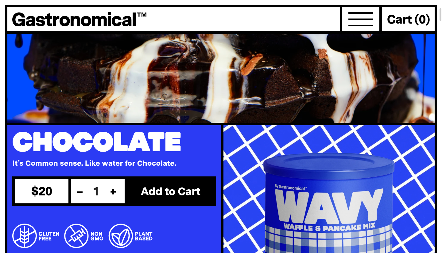
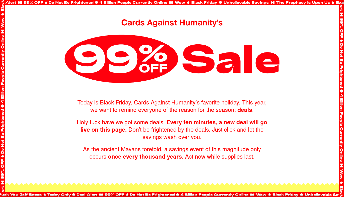
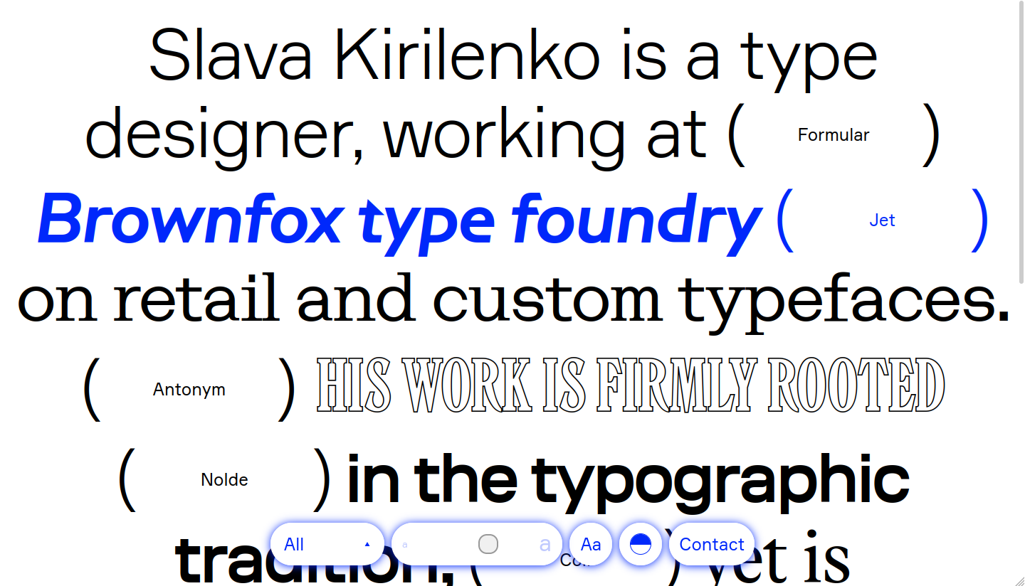
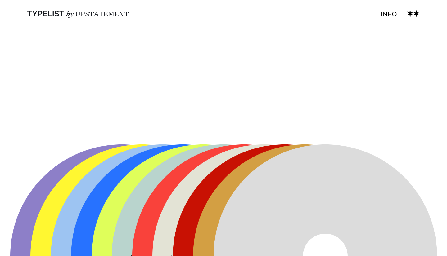
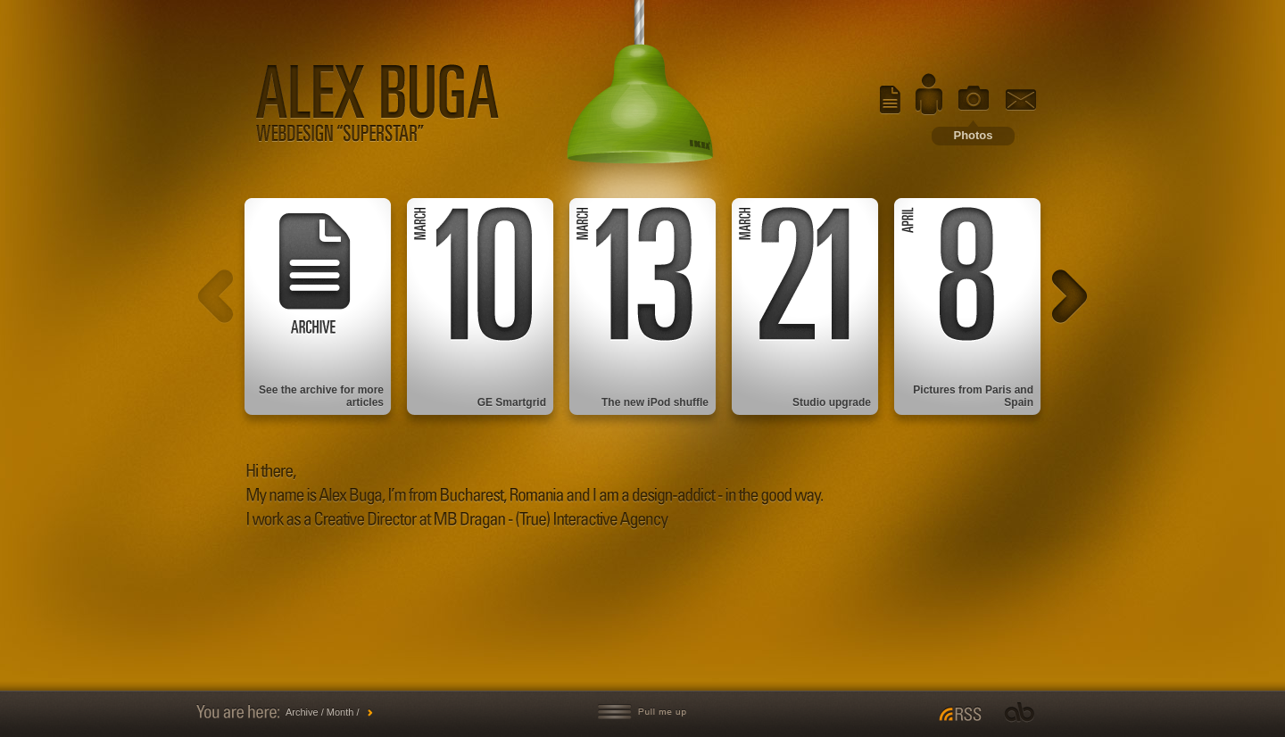
Brutalist web design is an aesthetic that's proven tricky to codify. It's often shockingly maximal but can also be stripped down and minimal. In either case, it aims to feel unconventional and unexpected. The term "brutalist" is loosely borrowed form brutalism, a mid-century architectural movement (though the two movements share very little aesthetic similarities). A brutalist approach to web design could mean presenting the raw HTML but it could also mean styling things in minimally or making them as gaudy as possible, so long as it's jarring.
Here are a few examples of brutalist web designs: -
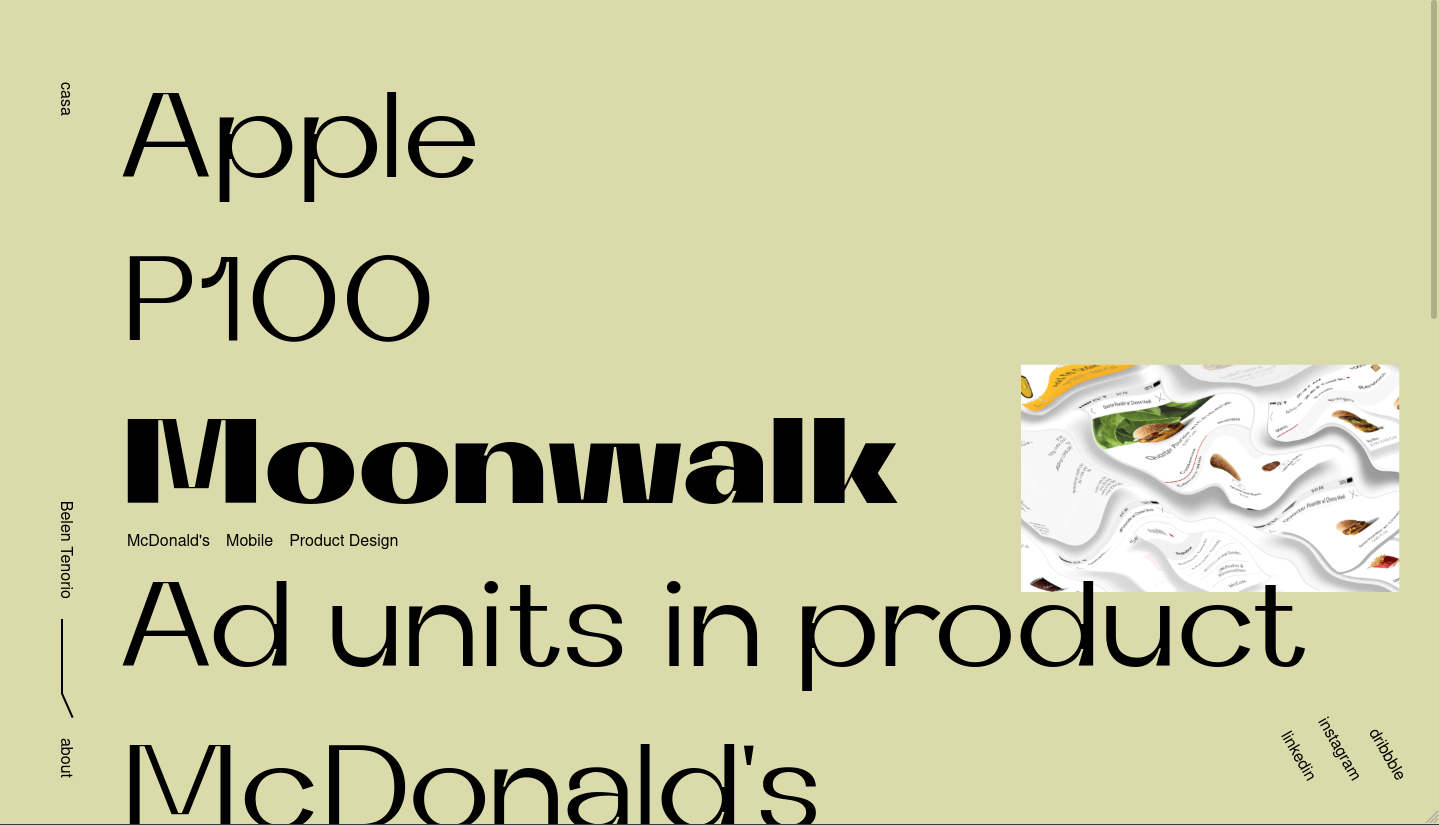
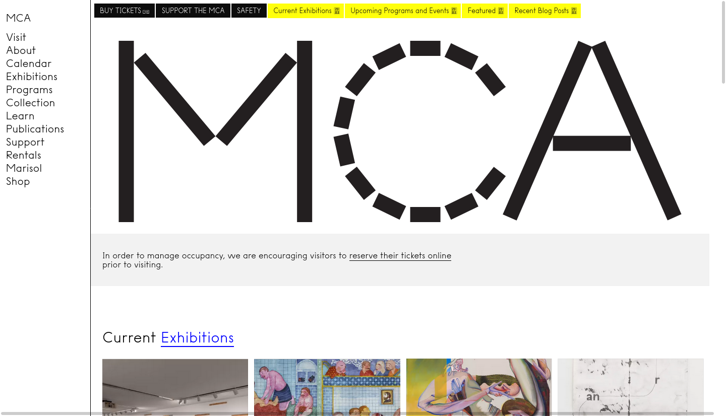
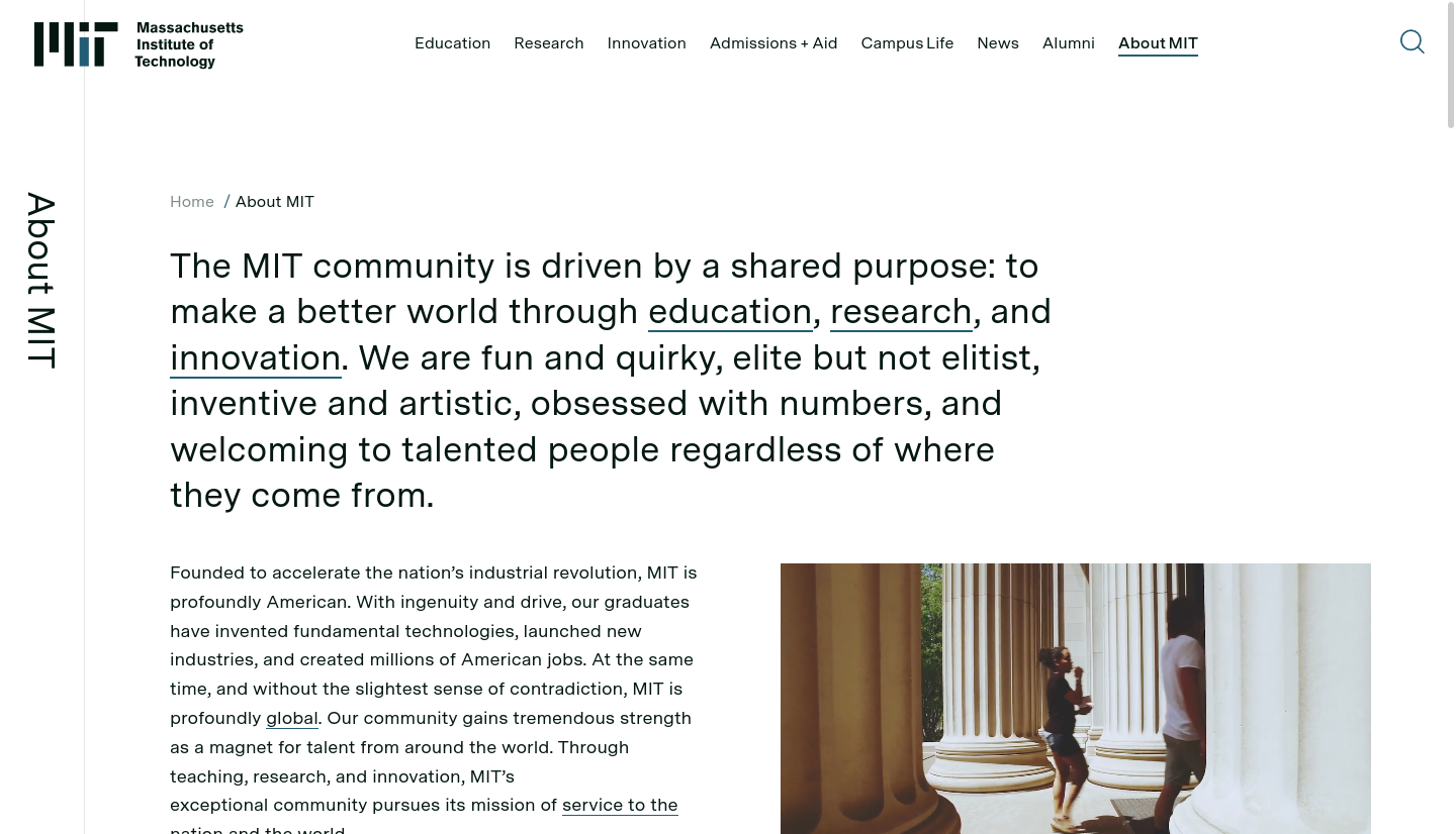
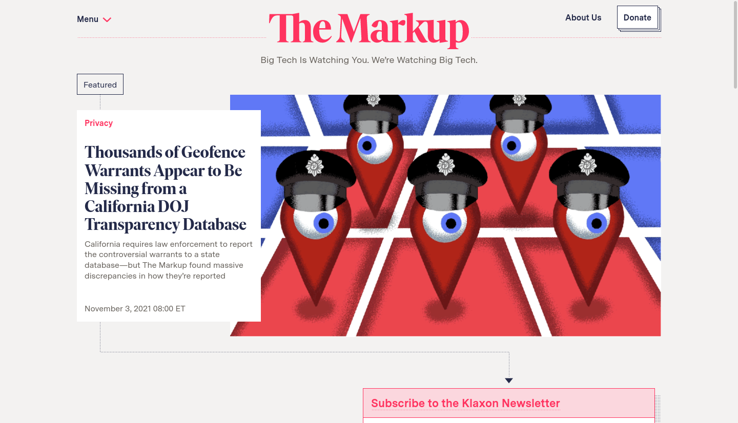
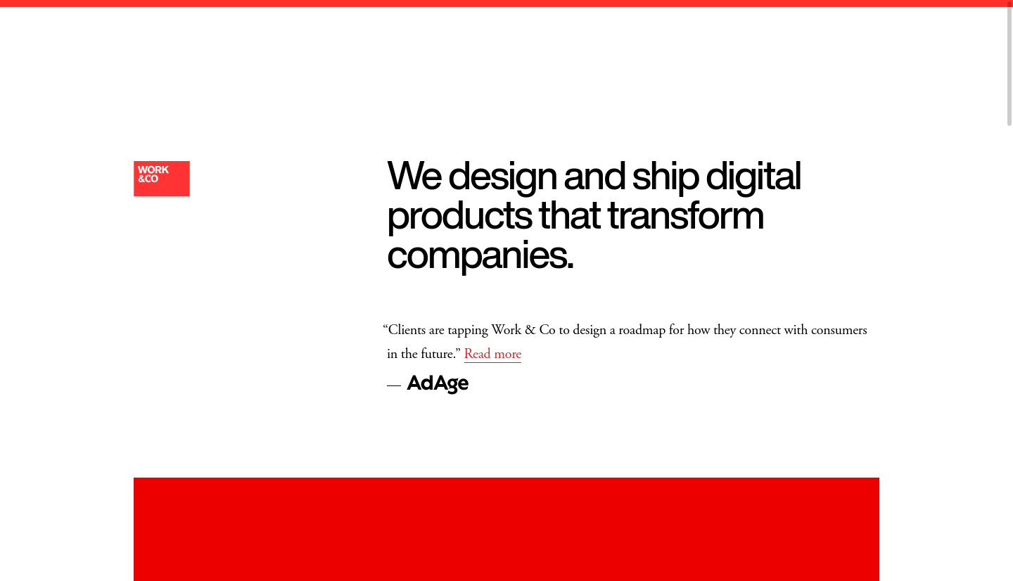
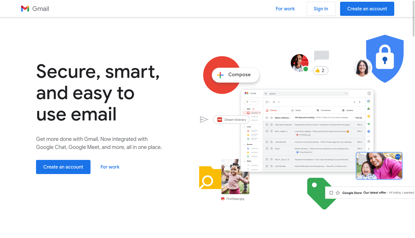
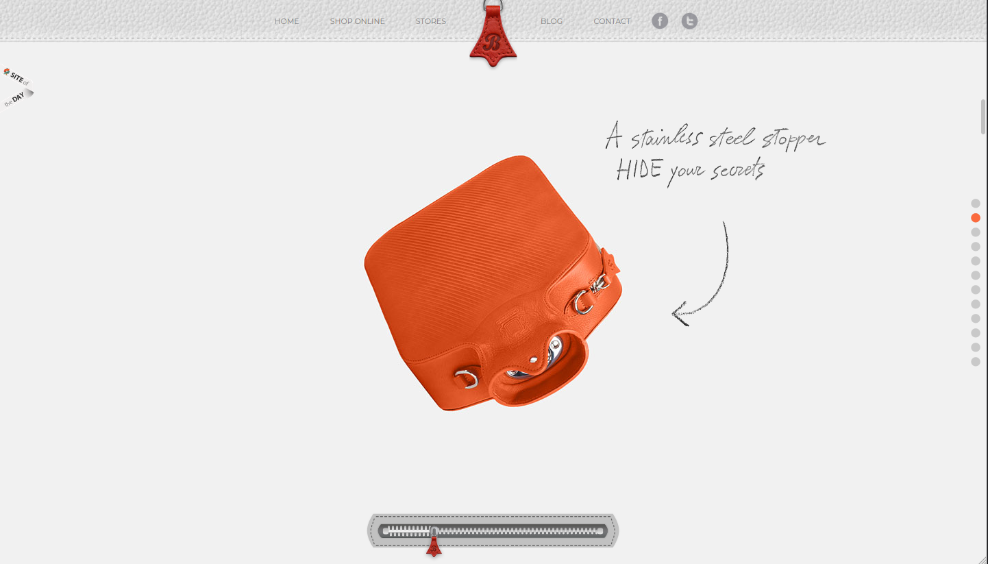
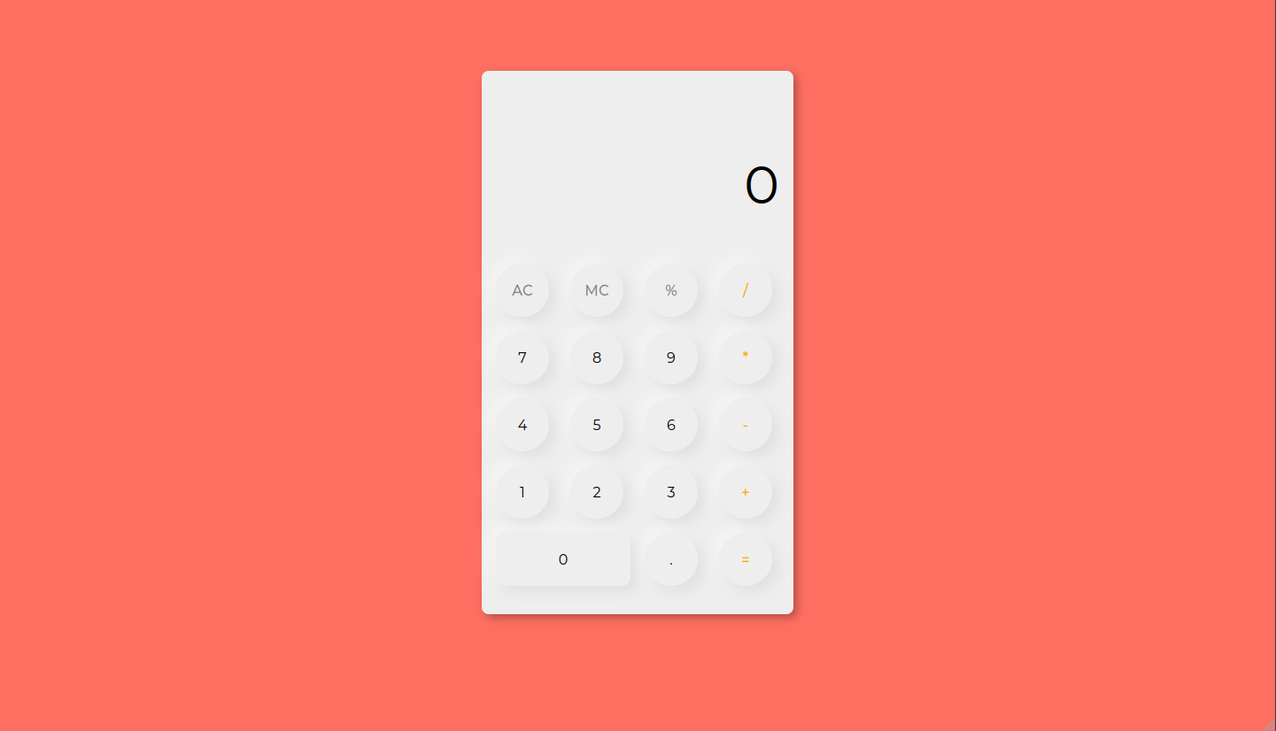
Minimalist web design, sometimes also referred to as "flat" design, is likely the most common approach these days. Generally this means clean lines, simple typography and plenty of white space. Colors are often used to draw the viewers eyes to certain aspects of the page and guide their experience. Instagram is a good example of fairly "safe" minimalist design. Consider Instagram's follow button. Goolge has it's own brand of minimalism it calls "material design", which plays with the metaphor of paper by adding slight drop shadows and subtle animations while keeping things relatively simple. Consider Gmail's send button. Another popular minimalist variation is what's known as "flat" design. Flat designs reject even the most subtle 3D effects like shadows and gradients. Consider Twitter's login button.
Here are a few examples of minimalist web designs: -
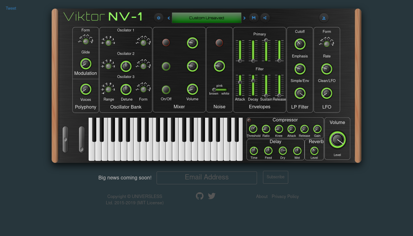
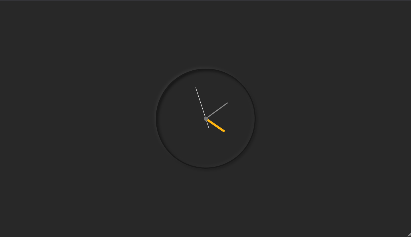
(sk/n)eumorphic web design refers to the evolution of design trends that aim to make the virtual feel physical. In the first decade of this century skeumorphism was all the rage. Wikipedia defines a skeuomorph as "a derivative object that retains ornamental design cues from structures that were inherent to the original." In web design this often means creating interface elements that mimic their real-world counterparts, often striving for realism and a tactical feel. For example, compare Instagram's current logo to it's original. Both logos symbolize a camera, but the original was skeumorphic because it almost tries to convince us that the logo is in fact a tiny camera sitting next to our other app icons. Consider this skeumorphic button.
Here are a few examples of skeumorphic web designs:
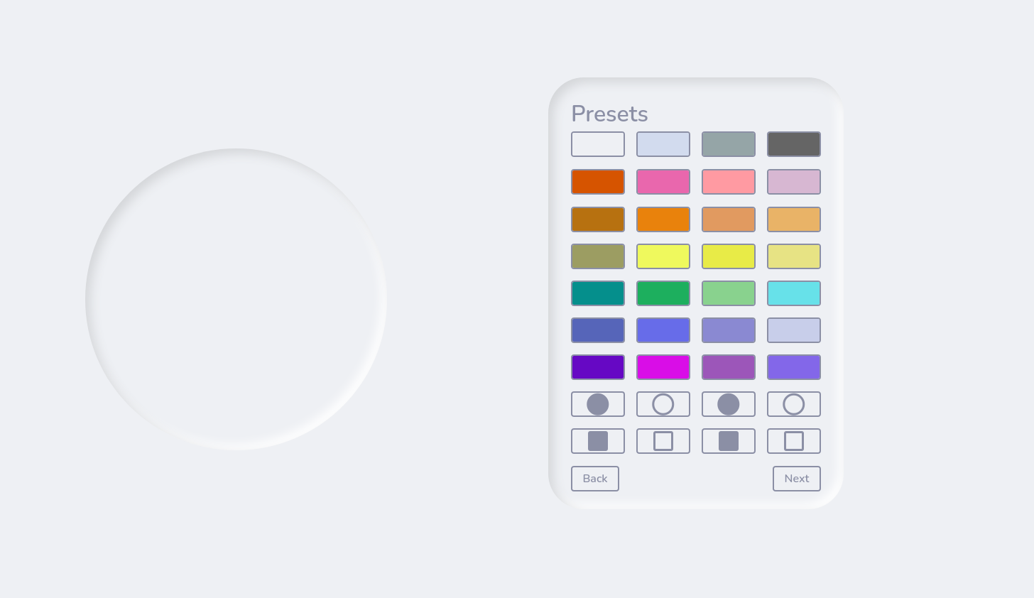
In recent years this trend has evolved into neumorphism, which is still concerned with the illusion of tactility and depth, but is less interested in realism. Neumorphism is something of a minimalist approach to skeumorphism, that might sound like an oxymoron, but consider this neumorphic button.
Here are a few examples of neumorphic web designs:
Responsive Web Design
Writing code that dynamically adapts a site's design to the viewers screen size/resolution is known as Responsive Web Design (RWD). I've put together an interactive RWD tutorial (~43mins; backup: video version here) which covers the basic concept and most popular techniques for achieving these. Below you'll find sketches for each of the techniques covered in the tutorial.